

|
Key takeaways
|
A logistics dashboard is the perfect playground for data exploration, as it lets you visualize almost any kind of data depending on your needs, issues, and control points. For instance, a logistics company may face frequent delivery delays. This issue has hidden root causes. The company’s executives, along with data analysts, consider all the metrics that influence deliveries, including:
- warehouse operators’ performance
- average order fulfillment time
- average vehicle loading time
- drivers’ performance
- vehicle idling time
Then, data analysts retrieve data on these metrics from corporate databases to include them on the supply chain analytics dashboard. The dashboard, in turn, can highlight the things that impede timely deliveries. Thus, supply chain data dashboards can be helpful in identifying the root causes of bottlenecks that decrease your company’s profits, lower your competitiveness, or increase customer churn.
Dashboards can also help you measure your achievements, encouraging you to set ambitious new goals.
Supply chain visualization contributes to the supply chain control tower, which allows company executives to efficiently monitor all business processes and make timely decisions.
In this post, we discuss common types of logistics dashboards, analyze popular supply chain visibility tools, and help you prepare your company for efficient logistics dashboards development. However, to make the most of logistics dashboards on your way to digital transformation, you should first ensure that your data analysis results in valuable information.
Visualize business-critical logistics data to derive immediate insights
Talk to our data visualization consultantsThe future of logistics dashboards
We’ve performed strategic research to find a few insights on how logistics dashboards are evolving and why implementing them matters:
- Building dashboards will become a common practice, but only for specific requests, without propagating redundant dashboards that only confuse rather than inform.
- In the near future, the lines between business intelligence and advanced analytics will be almost completely blurred, mostly thanks to the integration of AI/ML capabilities in BI reports and logistics dashboard generation with the help of data science services.
- Big data analytics will go hand in hand with BI dashboards to provide even more business insights and open new horizons of supply chain visibility.
Thus, it’s high time to seize the opportunity and start building custom logistics to derive value and solve common logistics issues that keep you up at night.
Want real-time supply chain visibility?
Explore our logistics IoT development services.
Key challenges a supply chain dashboard solves
Increased visibility helps deal with lots of challenging scenarios in the entire supply chain. When you’re aware of something, you get the power to change it. Whereas being in the dark takes away control and leaves you nothing but the necessity to reactively deal with the future uncertainty. Here are a few challenges you can take control of with the help of efficient logistics dashboards:
- Increasing operational costs. Dashboards give you a clear breakdown of where your resources are going, such as fuel, storage, or packaging. You can quickly spot patterns of overuse or underuse and develop targeted cost optimization strategies. Instead of guessing where the inefficiencies are, you’ll know exactly which activities drain your budget and which drive value.
- Changing customer demands. Customer preferences change fast. With a logistics dashboard tracking real-time demand signals, order trends, and satisfaction scores, you can respond before your competitors even notice the shift. This helps you align production and inventory with actual market needs, not outdated forecasts.
- Inefficient use of warehouse space. It’s easy to assume you need more space, but what if you’re just not using your current space efficiently? Dashboards give you a detailed picture of stock levels and turnover across all warehouse locations. They help you understand whether to expand, consolidate, or redesign layout strategies based on real usage data.
- Inventory stockout/overstock. Running out of stock leads to missed sales and disappointed customers. Overstocking, on the other hand, ties up capital and clutters your warehouse. Dashboards monitor SKU performance, turnover rates, and safety stock levels, helping you strike the right balance and maintain just the inventory you need.
- Surging transportation costs. Carrier costs can creep up quietly. Maybe a provider switched routes or changed equipment without alerting you, resulting in subtle increases that add up over time. Dashboards make such anomalies visible through trend lines and cost comparisons. You can see, for example, that delivery costs per mile jumped 12% last month, and take action before it becomes a bigger issue.
Dashboards turn your supply chain into a transparent, manageable system, where every decision is backed by real data and every action moves you closer to operational excellence. Let’s have a look at a few methods that can help you define the value of your data.
Increase visibility of your customer needs and deliver personalized logistics services
Logistics customer portal articleLogistics data evaluation methods
The methods we discuss in this section help you answer two major questions:
- What data is valuable enough to visualize and analyze?
- What data can you discard?
Efficient evaluation of your organization’s datasets requires fruitful collaboration within and across various business levels. If only C-level executives evaluate your organization’s data, they can come to subjective conclusions and miss important insights. While C-levels can have their own understanding of the business and, in some cases, rely on gut feelings, it’s wise to justify any beliefs and feelings with reliable data and facts.
Douglas Laney, an advisor on data analytics strategies, has developed data evaluation methods that he discusses in his book Infonomics. Among the many methods he proposes, we’ve chosen the two we consider the most important for logistics data visualization.
Method 1. Business value of information (BVI)
This evaluation model allows you to determine which business processes can benefit from which data by assigning a relevance score to each data asset with respect to a particular business process.
The BVI formula includes the following variables:

- Relevance — indicates whether a certain dataset is useful for a business process (it’s a subjective measure from 0 to 4)
- Validity — the percentage of data records that have correct values
- Completeness — the total number of data records in a particular dataset
- Timeliness — a score showing whether data is up-to-date and how quickly data is collected
Once you know which data is especially important for each business process, you’ll be able to visualize and analyze only those datasets that bring the best outcomes. This can also help you prioritize your business processes to prevent you from randomly rushing into the analysis of each and every one.
Method 2. Performance value of information (PVI)
Another method shows how data assets impact key performance indicators (KPIs). Douglas Laney suggests that this method answers the question: How much does having this information improve business performance? The PVI approach is preferred for measuring business benefits from certain business metrics.
The PVI formula contains the following variables:

KPIi = business processes functioning with information (informed group)
KPIc = business processes functioning without information (control group)
T = average lifespan of the data instance
t = duration of the KPI measurement
A positive PVI means that a dataset is valuable for a certain business process, whereas a negative PVI indicates that the dataset is not valuable for the process.
Performance value of information can help you match the right datasets with the right business metrics to derive the most value for your business.
These two foundational data evaluation techniques tell you which data is relevant to your core business processes and performance metrics. Thus, you’ll know which data would be beneficial to include on your dashboards so they generate the most insightful information.
Key KPIs for logistics performance
Depending on your business focus, you can choose not only relevant data for performance assessment but also critical KPIs, for which you’ll gather high-quality and up-to-date information. Below are the eight most common logistics KPIs that can be effective at different levels of your business performance evaluation.
|
Inventory turnover |
Order cycle time |
On-time delivery rate |
Warehousing costs |
|
Transporation costs |
Return rate |
Equipment performance |
Shipping time |
These KPIs cover core areas of the logistics business such as managing inventory, orders, warehouses, and equipment. There are many more KPIs for different logistics services, but covering even those eight can already give you a good understanding of your current business performance.
Next, let’s discuss different types of logistics dashboards to see how to arrange diverse KPIs to fit changing logistics business needs.
Supply chain dashboard types for every management level
In this section, we take a look at three types of logistics dashboards, each corresponding to a particular level of supply chain management: strategic, tactical, and operational. You can also explore logistics optimization technologies to choose for different levels of management. When employees at all supply chain levels are on the same page, the company has a greater chance of achieving that alluring supply chain visibility everyone is aspiring for.

Of course, it’s not only horizontal supply chain management levels that influence your choice of a logistics dashboard; you should also consider the vertical organizational levels of the supply chain. A logistics manager at the tactical level from the transportation department measures different KPIs than a manager at the same level but from the order fulfillment department. Further, we give examples of supply chain dashboards taking into account a horizontal and vertical organizational structure.
Level 1: Strategic
A strategic supply chain dashboard is built for the organization’s top management. C-suite executives need a helicopter view of the business to measure KPIs based on accurate and relevant data.
Such a supply chain logistics dashboard helps executives make long-term decisions (e.g., how to improve company services to meet volatile market demands, how to decrease operating costs, and increase revenue) and analyze business performance on a large scale.
Strategic dashboards must be based on business needs and goals, as they set the agenda for lower types of dashboards. For example, Canadian natural health products distributor Purity Life experienced a $500,000 drop in inventory reserves thanks to strategic dashboards that highlighted important inventory management issues, which, in turn, prompted efficient actions at lower stages of supply chain management. Another example is from one of our clients, a US 3PL company. As part of our big data analytics solution, we implemented a scalable business intelligence solution for data visualization to help company executives make more informed decisions, predict stock planning, and optimize route and load planning.
Strategic dashboards will be different for different C-level executives. CEOs, CTOs, CFOs, CIOs, and CMOs each need a different supply chain metrics dashboard, and it’s impossible to build a custom logistics dashboard that satisfies them all. Some of their needs and interests, of course, intersect, but many KPIs are different. Let’s have a look at a supply chain metrics dashboard that could interest a COO.
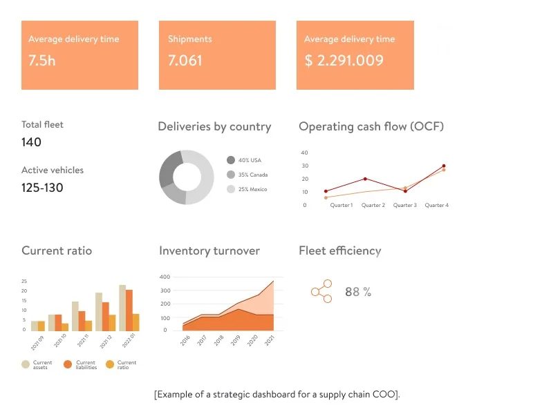
Learn how fleet management software can increase your fleet and driver productivity
Read the articleLevel 2: Tactical
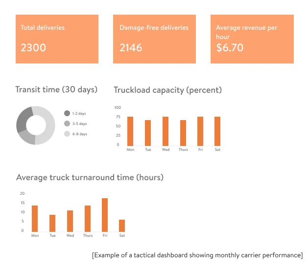
Mid-management teams work with tactical dashboards that show monthly, quarterly, and annual business performance. With the help of tactical dashboards, middle managers can set mid-term company goals which, roughly speaking, are steps towards meeting full-scale strategic goals. Such dashboards can also reflect whether a business is actually moving towards strategic goals, as C-level executives can sometimes set goals that are too ambitious or unrealistic.
Mid-level managers may want to see, for example, a carrier’s performance over a month to decide whether it’s worth continuing cooperation. Wilko, a UK retailer of household goods, decided to build full-fledged carrier software to manage multiple carriers and efficiently track their performance. This solution allowed Wilko to achieve cost savings of around £250,000 during the first year after implementation.
Let’s imagine how a tactical logistics dashboard for tracking monthly carrier performance can look:
Carrier scorecard: How to effectively implement metrics to improve logistics services
Read the articleLevel 3: Operational
The third dashboard type is operational. Such dashboards help logistics managers monitor day-to-day supply chain operations like order fulfillment, production, load planning and space calculations, and delivery to make timely changes to the workflow when necessary. These dashboards facilitate even smaller steps towards meeting general strategic goals.
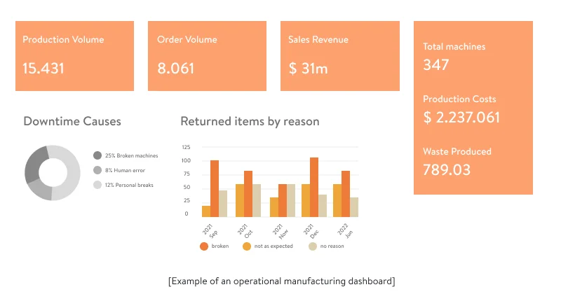
Operational dashboards help logistics managers tackle troublesome logistics areas in a timely manner before they impact higher levels. For instance, they can do this by ensuring preventive maintenance for equipment with decreasing performance metrics. Swedish seal and bearing manufacturer SKF has long been using data visualization techniques to monitor machine efficiency. This allows the company to grow year over year. SKF even offers its own technical solutions to help other manufacturing companies maintain a high level of machinery performance.
Let’s have a look at an example of an operational manufacturing dashboard.
It’s essential for a company to develop logistics dashboards for all three supply chain levels, as visibility at the lower operational and tactical levels helps the company to achieve strategic long-term goals. There is also a certain domino effect, as if anything goes wrong on the operational level, this may affect higher levels. And vice versa: vague and unrealistic goals at the strategic level will make dashboards useless and lead to chaotic management at the tactical and operational levels. Strategic logistics dashboards can have a drop-down feature that allows clicking on a particular indicator or figure to see how it was formed (e.g., to trace transaction chains) at lower levels.
The main types of supply chain dashboards
After discussing what a logistics dashboard for supply chain management levels is, we can focus on supply chain dashboards for the most common logistics use cases: inventory management, warehouse management, transportation management, and order management.
To achieve high supply chain efficiency and visibility, you should first establish critical KPIs to track, then think through how to capture, process, and transfer the data to the consolidated storage to easily retrieve it and visualize it on an interactive dashboard.
Inventory management
Achieving efficiency in inventory management helps avoid stockout and overstock, effectively fulfill customer demand, fix staffing issues, and, most importantly, optimize inventory storage costs. With the help of informative dashboards and by collecting relevant data from inventory management systems, you can track all of the inventory KPIs and discover hidden root causes of common issues.
For instance, by comparing your days inventory outstanding (DIO), which stands for the number of days it takes to sell an item, with the total number of inventory available, you can identify slow-moving stock that ties up capital and warehouse space, and adjust your purchasing or pricing strategies accordingly.

Warehouse management
For your warehouse operations to work like a clockwork, you need to know how to manage warehouse space by quickly and accurately distributing inventory, setting up energy optimization devices, and avoiding over- and understaffing.
The most common KPIs to track in the warehouse would be: stock levels, stock value, quantity of received and shipped cargo, pallets in use, and total SKUs. Plus, depending on your goals, you can also track many other KPIs such as staff number on weekdays and weekends, and time spent storing SKUs to define which products are stored for too long and take up space. Let’s look at the examples of the warehouse management dashboard to see what it can look like in reality. Get creative with your dashboards and collect all the relevant data from your warehouse management systems.

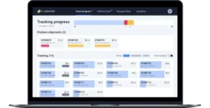
Transporation management
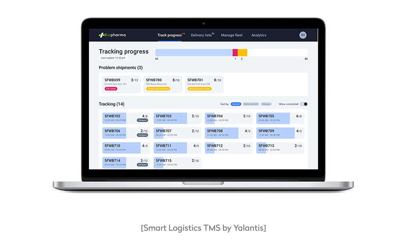
Optimizing delivery routes and transportation costs can help you increase customer satisfaction, improve supplier-carrier relationships, and gain a competitive advantage. By tracking such key metrics as the number of on-time deliveries, problem shipments, shipment progress, and drivers’ productivity, your team can get firsthand insights on how your company delivers products and services, and how to improve this flow.
By developing a comprehensive transportation management system with interactive dashboards, we helped a US-based logistics company simplify delivery route planning and monitoring, and fix most of their order, delivery, and employee issues. Their new SaaS-based TMS included informative smart logistics dashboards that revealed the essential delivery information in real-time. Now, it takes their logistics management team only 30 minutes to compose and optimize a delivery route compared to the several hours it took before. That’s the power of visibility and automation.
Discover more automation possibilities for the supply chain industry
RPA in logistics articleOrder management
Understanding the full cycle of your order processing allows you to quickly spot bottlenecks and solve them. If you lack visibility in the order fulfillment process, you risk getting trapped in a vicious circle of losing money and customers. A custom order management dashboard can show you who your customers are, where they order from, which items are most popular, and what the average order fulfillment rate and return rate are. Have a look at an example below to have a better understanding of order management via a dashboard.

Let’s now find out how valuable data visualization for logistics is in the context of the control tower framework for supply chain management.
Control tower impact on each supply chain management level
The consulting firm Kearney provides an overview of a supply chain visibility control tower and discusses how valuable it is for supply chain management levels in the illustration below. Kearney analysts have come to the following conclusion: it’s the strategic level that defines whether a control tower and, as a consequence, data visualization will bring value to other supply chain management levels. Thus, it’s beneficial to start with elaborate strategic dashboards first and then move to develop dashboards for lower levels to analyze the necessary supply chain control tower metrics.
Now, we come to the practical part of our article: analysis of common business intelligence tools.
Modern BI and analytics tools comparison
Next, we’ll compare common BI tools that help us build different logistics analytics dashboards. There are many BI tools on the market, and you can consider your goals and needs to choose the most appropriate one. An important reminder: to implement any BI tool in your organization, you’ll need a trustworthy logistics software development team of specialists to configure everything correctly and build the desired dashboards the way you want.
We’ll take a look at the five common tools, such as Tableau, Power BI, Qlik Sense, Amazon QuickSight, and ThoughtSpot, and offer you an easy-to-follow comparison table. You can use it as a guide to making your own decision. Also, make time to read our article on the difference between BI and advanced analytics solutions. The article addresses many supply chain dashboards examples and use cases for both business intelligence and advanced analytics.
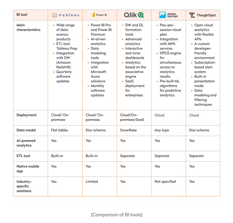
All of the above tools have many features in common, so it might be difficult to make the right choice. We suggest you consider the other services and tools you use at your organization. For instance, if you’ve recently deployed an enterprise data warehouse on Amazon Redshift, you can automatically connect all of your data to Amazon QuickSight by simply approving it in your account settings.
If Microsoft Azure services are more common at your company, you can consider Power BI. If you don’t depend that much on any particular vendor, you can consider Tableau, Qlik Sense, or ThoughtSpot. And, of course, you should compare each vendor’s prices to ensure you get a balanced and cost-effective solution.
The list of BI tools we’ve discussed in this section isn’t exhaustive. To navigate all the choices, make a list of priorities and non-negotiables.
Preparing for supply chain dashboard implementation
You can build an efficient supply chain performance dashboard only if you thoroughly prepare. Below are things to consider before implementing logistics dashboards in your organization.
- Robust data fabric. Under the hood, you’ll need to ensure a modern data stack responsible for data ingestion and data storage. The optimal solution could be implementing a data repository as a single source of truth for all your corporate data. Check out our extensive guide on data repositories to ensure you implement the right one. In case you’ve already made up your mind in favor of building an enterprise data warehouse, you can read another blog post to find out what you need for this process to go smoothly. Once you’ve consolidated the data necessary for analysis in one place, providing data analysts with a single point of entry, you can move to implement business intelligence.
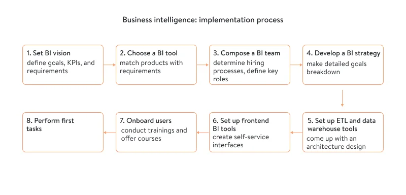
- BI implementation. Another important step is thinking through how to integrate business intelligence into your logistics workflow, taking into account all of your business needs, requirements, and goals. You can use the following schema to make sure you don’t miss anything. It contains seven important steps to take before launching data visualization projects.
- Training on data literacy. All of your attempts to derive value from BI tools will fail if you don’t ensure your employees understand how to manage, share, and treat your corporate datasets. It’s also important to keep up with modern data trends to become a leading supply chain company. Additionally, you should evaluate to what extent your employees are flexible in adopting new ideas and changes. In our article on how to prepare for building a digital transformation roadmap for a supply chain company, we offer clear steps to help you with changing the mindset in your organization.
Only with a balanced blend of the right vision, data technologies, and people can you begin developing insightful logistics dashboards.
Wrapping up
To begin with data visualization today, managers, along with their data teams, should:
- specify which issues in the organization hinder proper business performance or which areas need significant improvement
- define which data and data sources are valuable and relevant for analysis
- build an efficient data fabric to ensure secure data storage and easy data retrieval
- think through how to implement BI reporting and analytics dashboards in the logistics workflow
- make a clear request for building data dashboards (e.g., a supply chain risk management dashboard), depending on the manager’s position in the horizontal and vertical organizational structure
These five steps seem straightforward, but each requires hours of diligent work. At Yalantis, we strive to make the process of data visualization as seamless as possible for our clients, no matter how difficult each client’s case seems. We’re open to tackling any of your logistics data challenges and helping you reap the benefits of building informative logistics dashboards.
Don’t know where to start with data visualization? We’ll back you up.
Contact usFAQ
How long does it take to build a custom logistics dashboard?
The timeline depends on the complexity of your logistics operations, data availability, and required features. A basic dashboard using existing data sources can take 4–6 weeks. More advanced setups, integrating ERP, TMS, warehouse data, and predictive analytics, may take 3–4 months. A phased rollout often makes sense: start with core KPIs and expand as your needs evolve.
Are cloud-based logistics dashboards secure for enterprise use?
Yes, if built with the right security protocols. Enterprise-grade cloud dashboards use encryption, access controls, and compliance frameworks (like ISO 27001, SOC 2, or GDPR) to protect sensitive data. You can also define role-based access levels to ensure each team sees only what’s relevant to them. In many cases, cloud solutions offer better scalability and security than legacy on-prem systems.
Can dashboards integrate with our existing ERP or TMS?
Most modern dashboards are designed to connect with systems like SAP, Oracle, Microsoft Dynamics, or custom-built ERPs and TMS platforms. Data connectors, APIs, and middleware solutions make it possible to pull real-time or batch data directly into your dashboard, eliminating data silos and streamlining reporting.
What are the must-have features of a logistics dashboard?
A strong logistics dashboard should include: real-time tracking of shipments, inventory, and warehouse activity; drill-down capabilities for granular analysis (by SKU, location, carrier, etc.); predictive alerts for delays, stockouts, or SLA violations; KPI visualizations like order cycle time, fulfillment rate, DIO, and transportation cost per unit; custom filters and views for different roles (e.g., logistics managers, finance, warehouse leads); mobile responsiveness so teams can monitor operations on the go.
Are dashboards effective for multi-location or global operations?
Yes, especially when visibility is critical across a distributed supply chain. Dashboards can consolidate data from multiple warehouses, carriers, and suppliers across regions, helping you compare performance, identify bottlenecks, and act on local trends. You can set up geo-based filters, monitor KPIs by region, and even localize views for teams in different time zones or business units.
How do dashboards help reduce operational costs in logistics?
Dashboards uncover inefficiencies you might otherwise miss, such as underutilized storage space, slow-moving inventory, or unprofitable routes. They enable proactive decision-making by showing cost trends over time and surfacing outliers. For example, noticing that a certain carrier’s average delivery cost rose 15% over three months could prompt a renegotiation or switch. By monitoring real-time data, you can quickly adapt and avoid costly delays or waste.
About the author